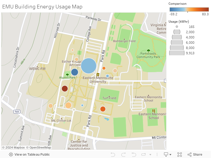
Energy Usage Map
Below is a campus energy usage map that gives the net energy output of most buildings on campus. The size of the bubble over that building indicates the net energy output, so the larger the bubble the more energy that building is using. The color of the bubble is a comparison to the energy output of the building yesterday. If the bubble is red then the building is using much more energy today than it did yesterday, and conversely if the bubble is blue the building is using less energy than yesterday. Hover over the bubbles for more information