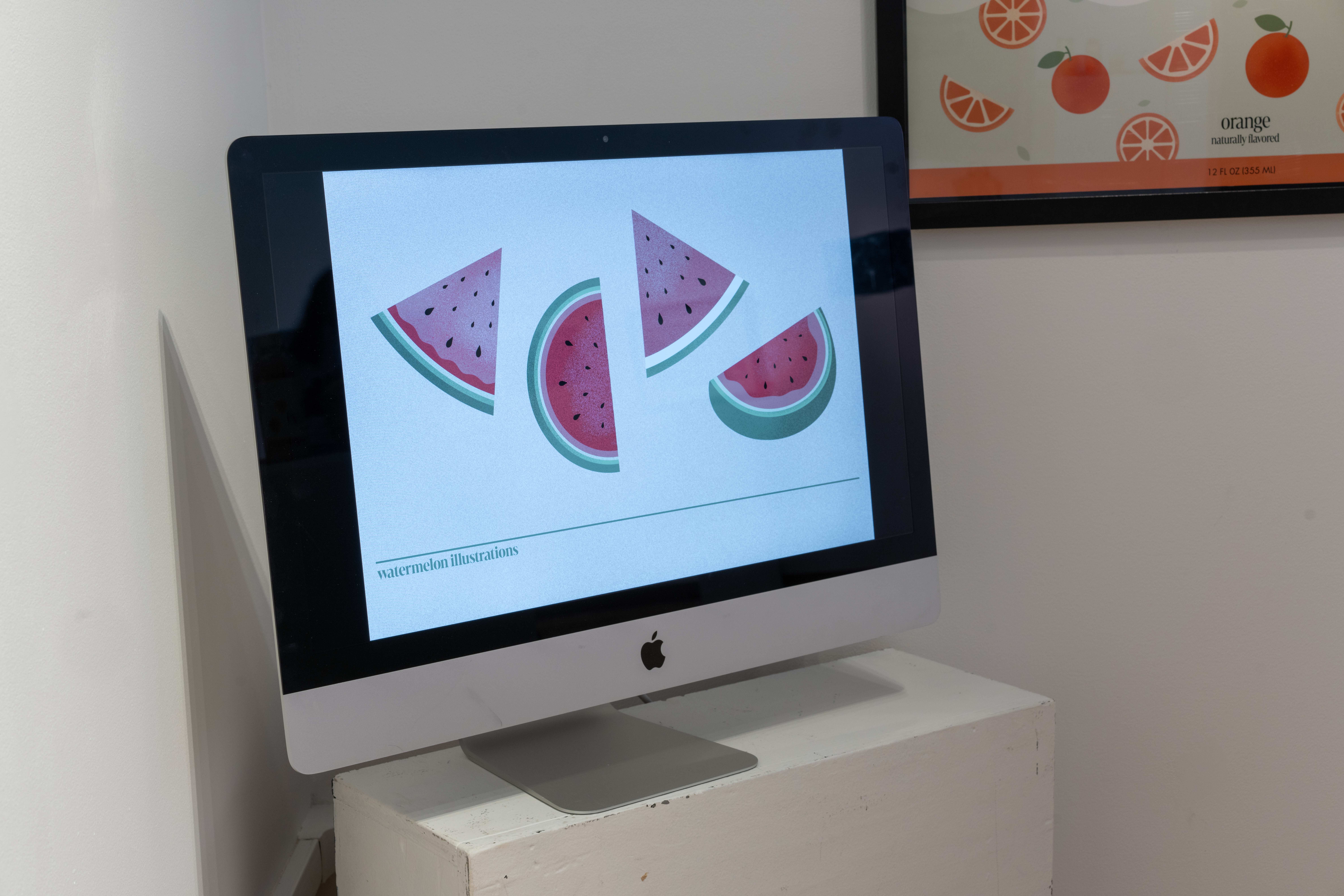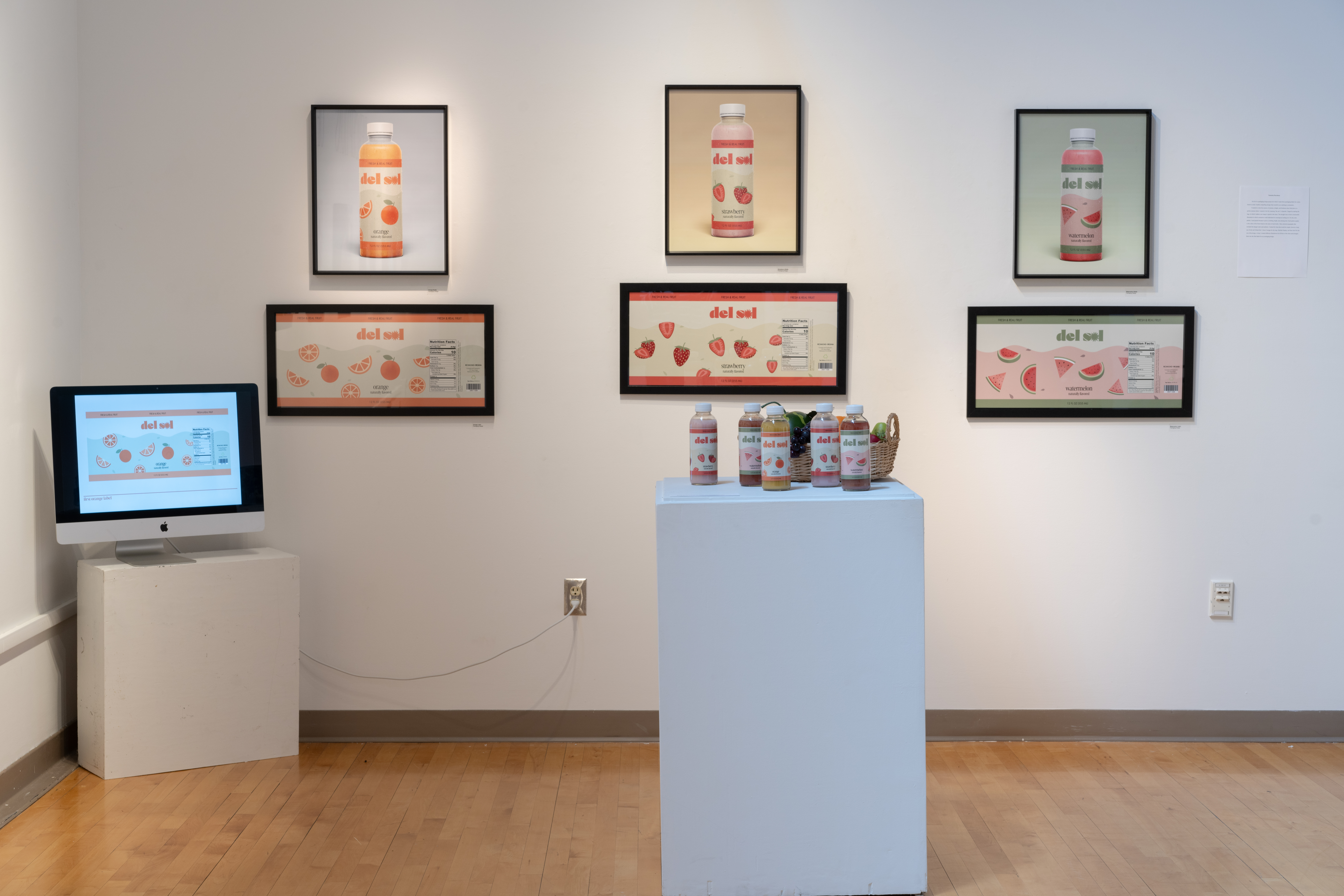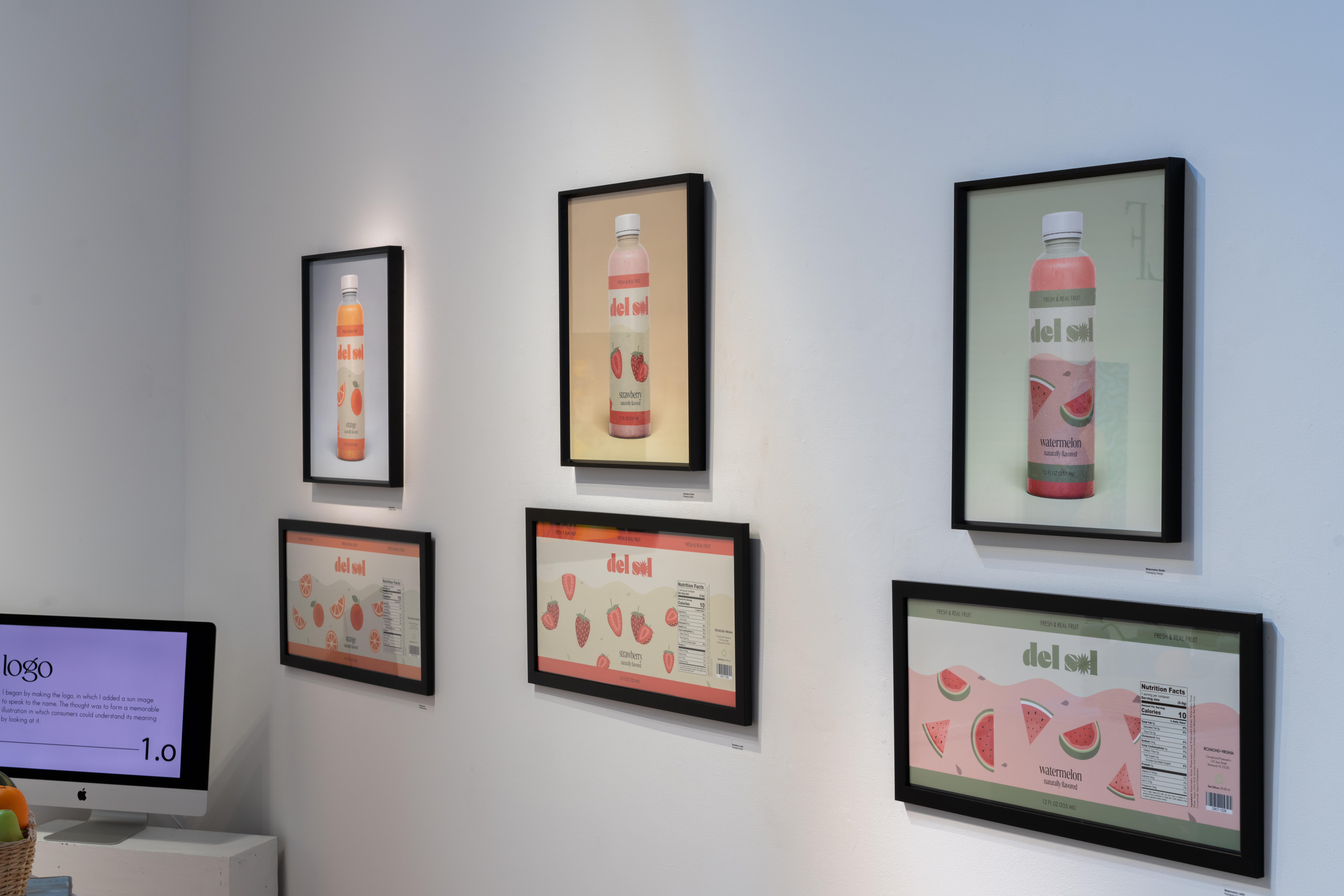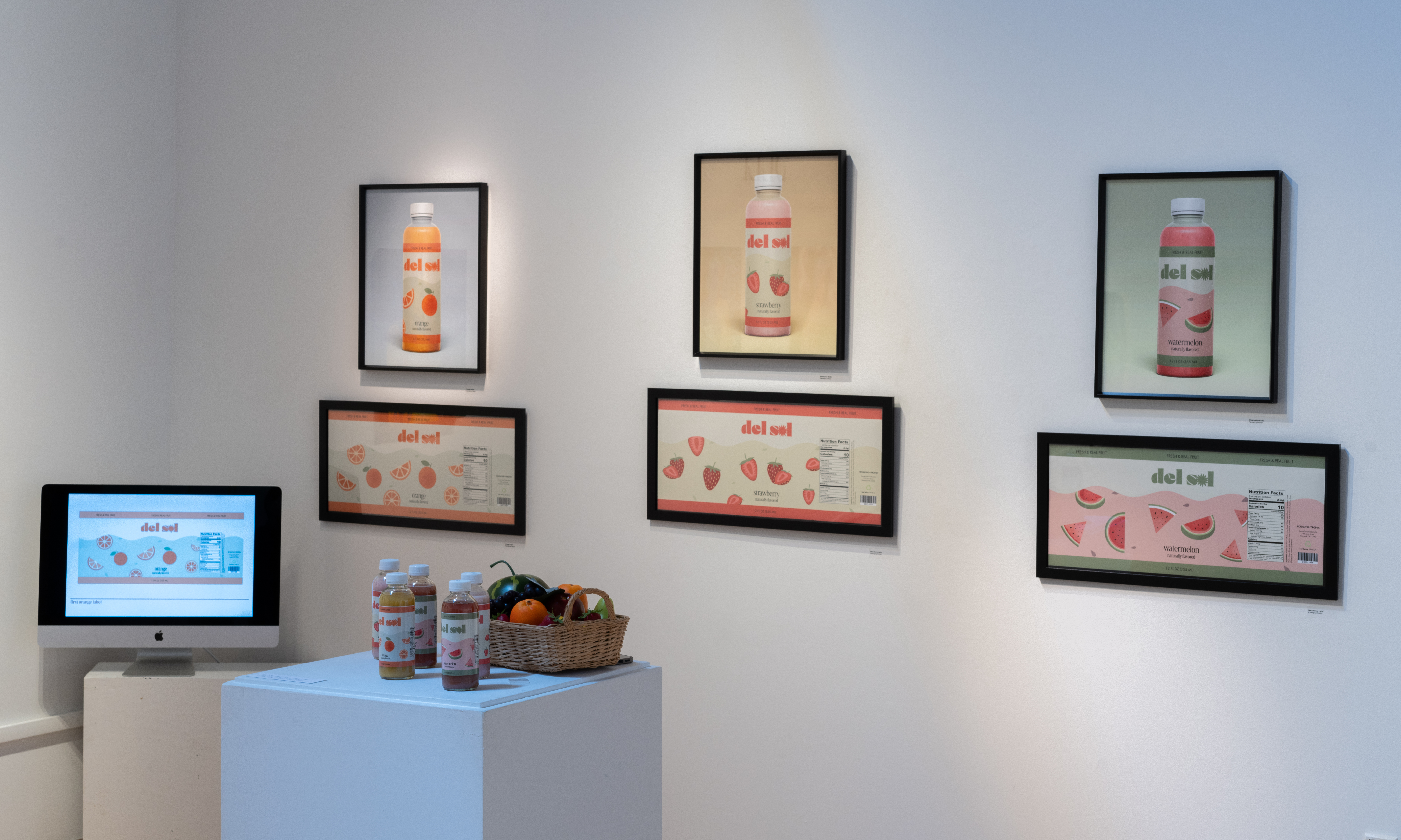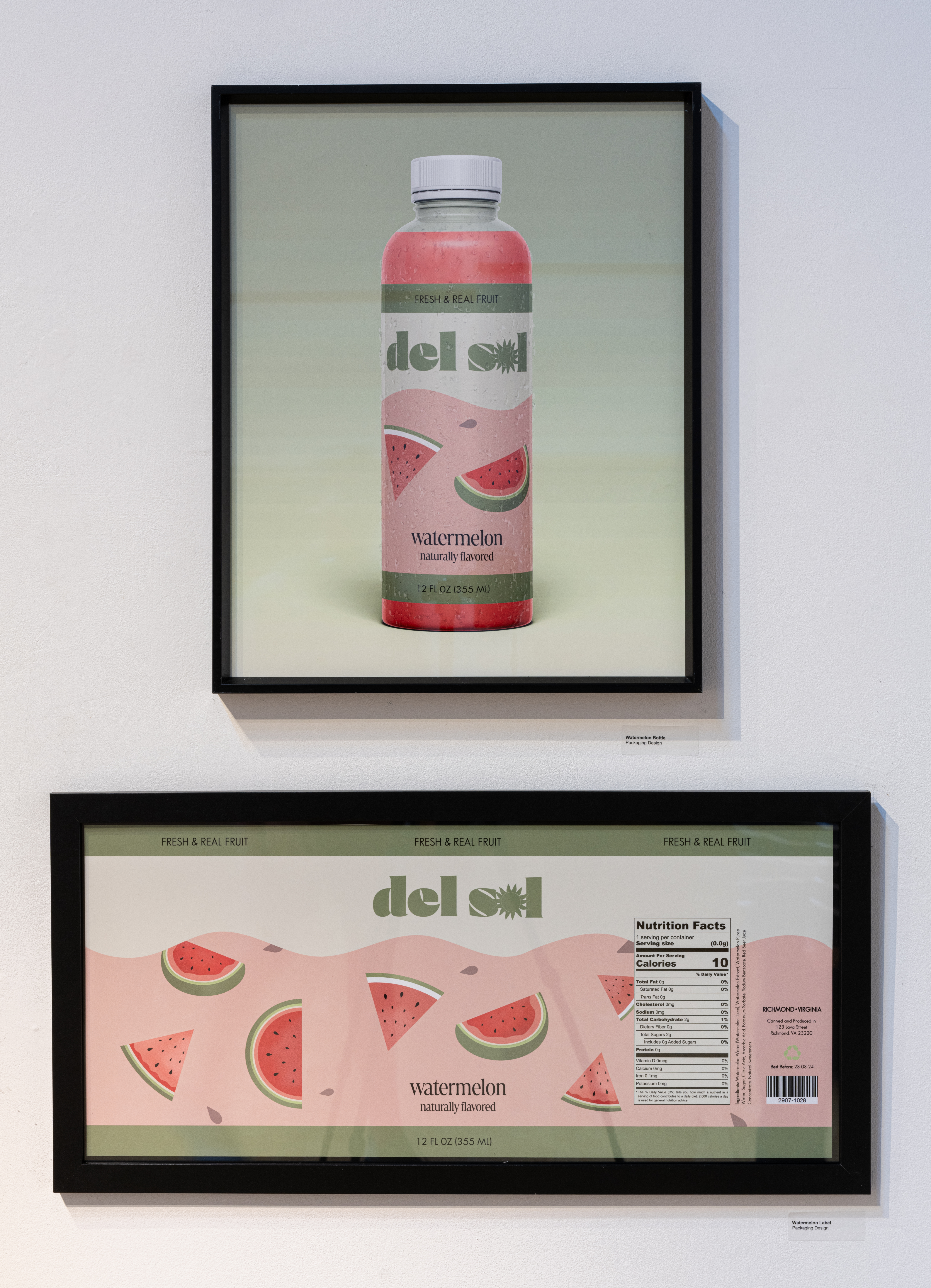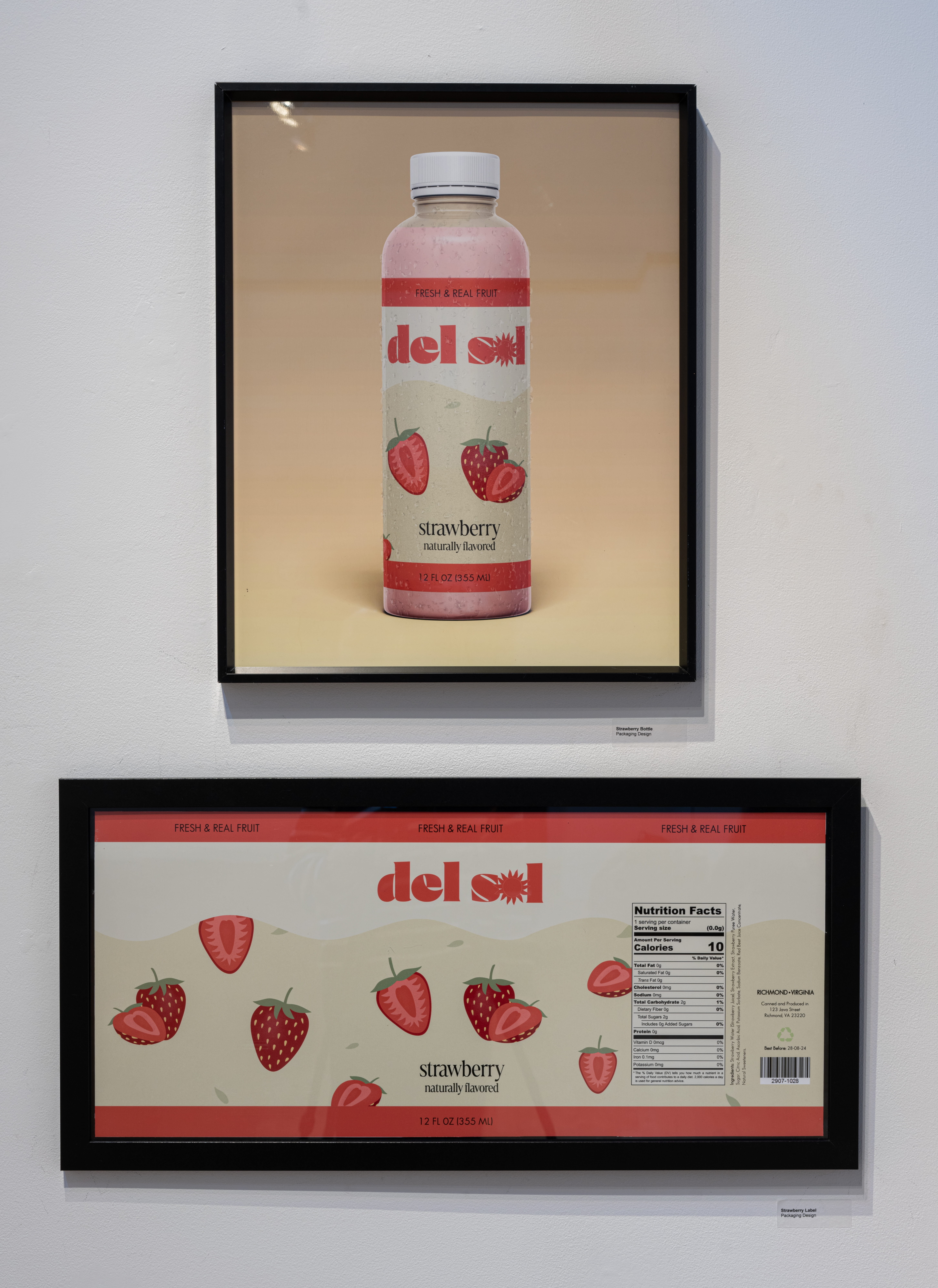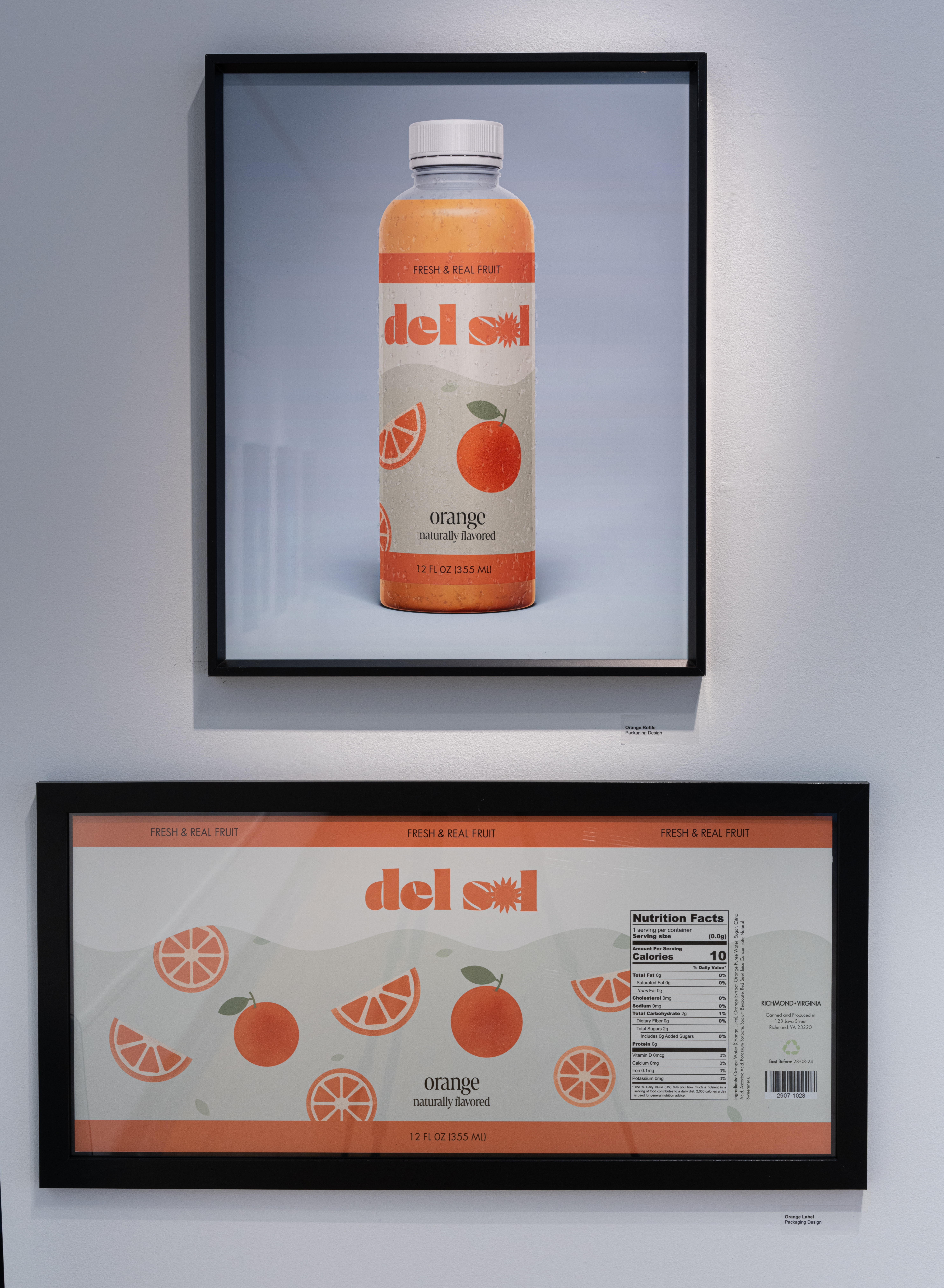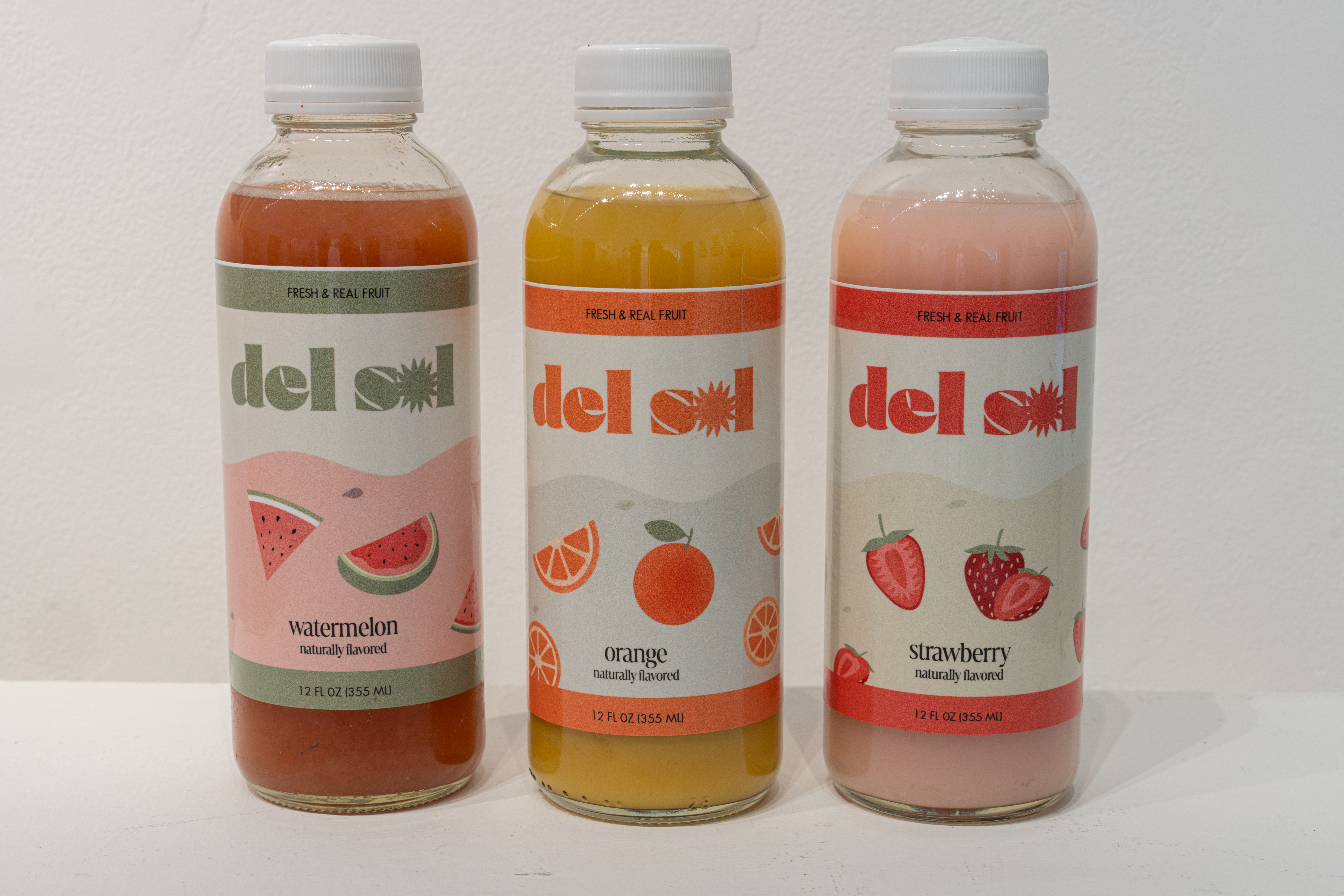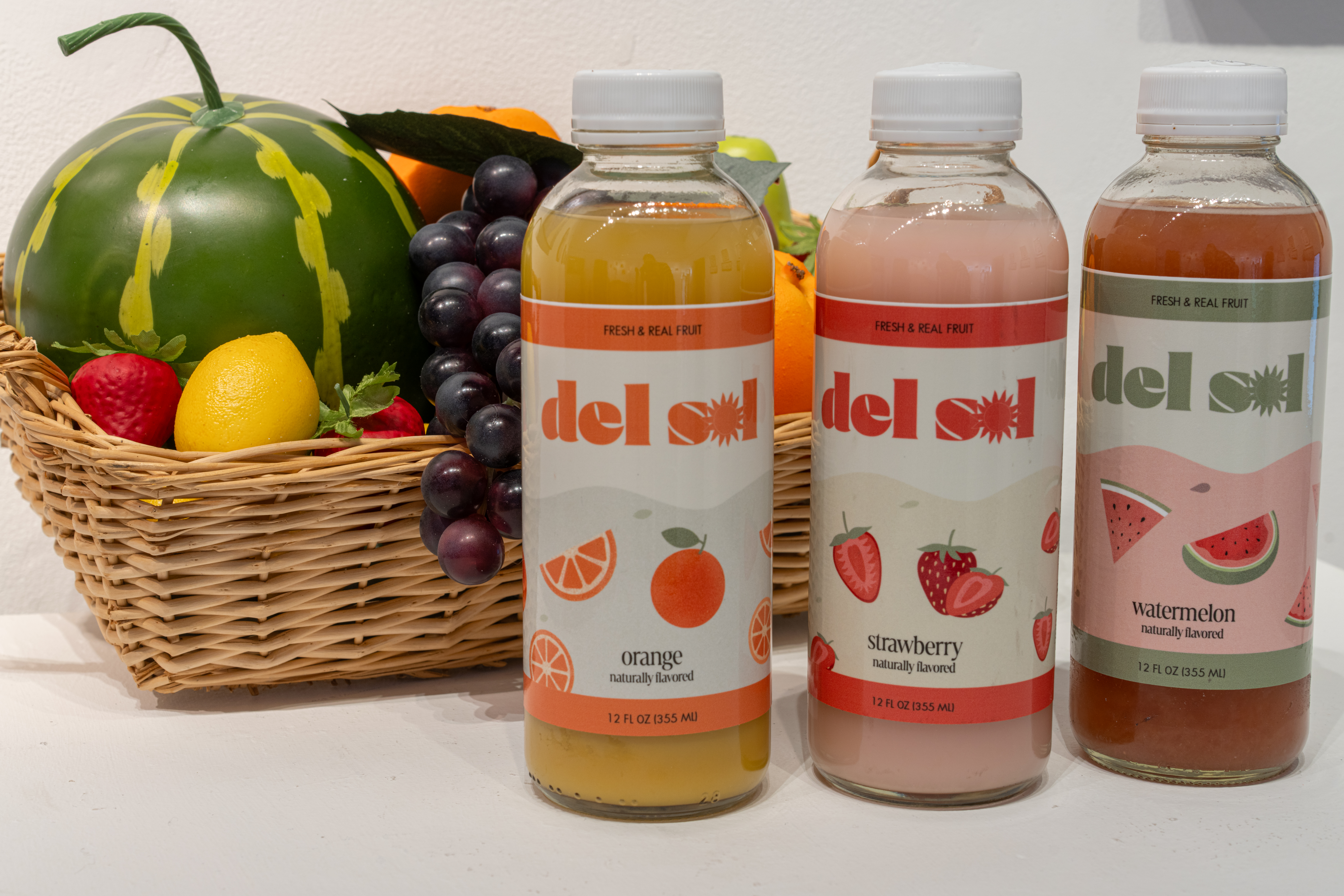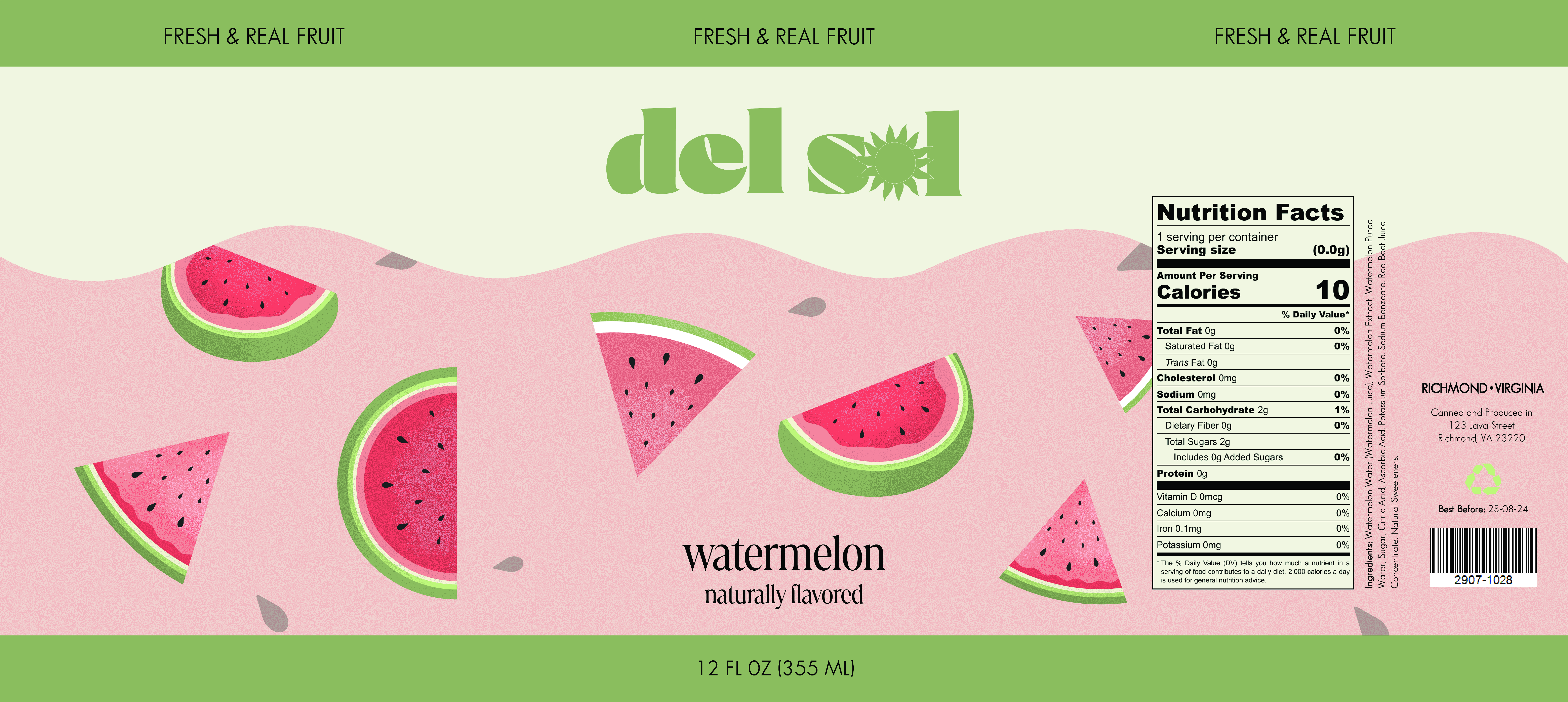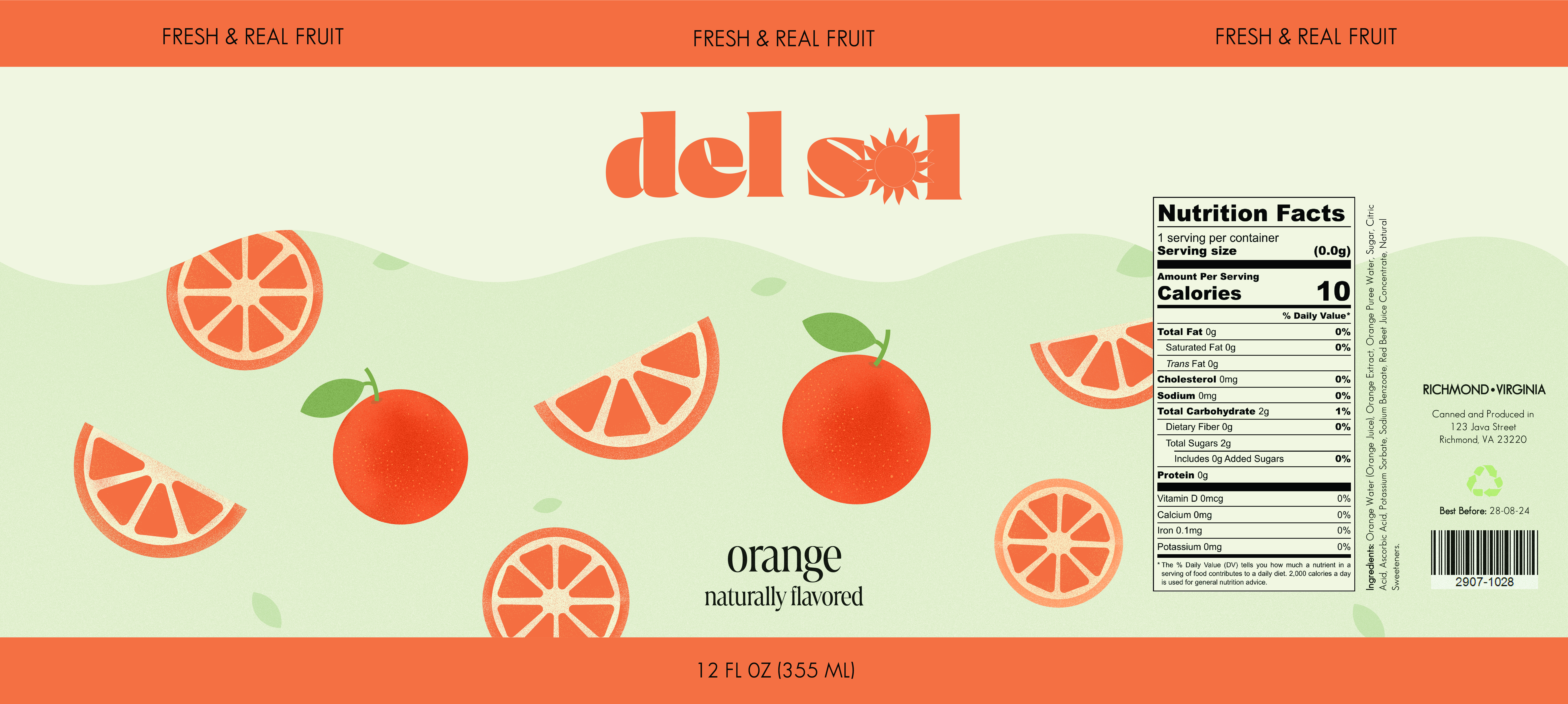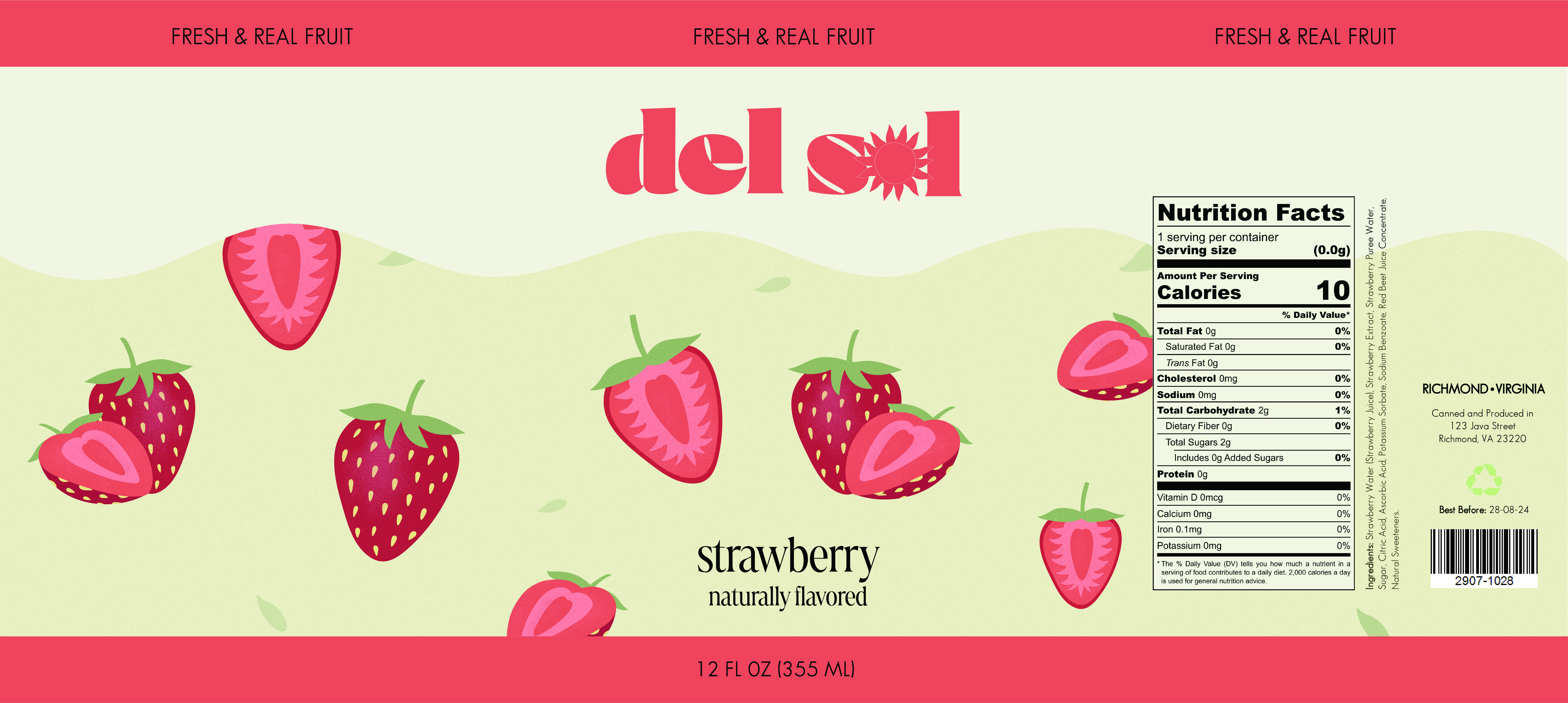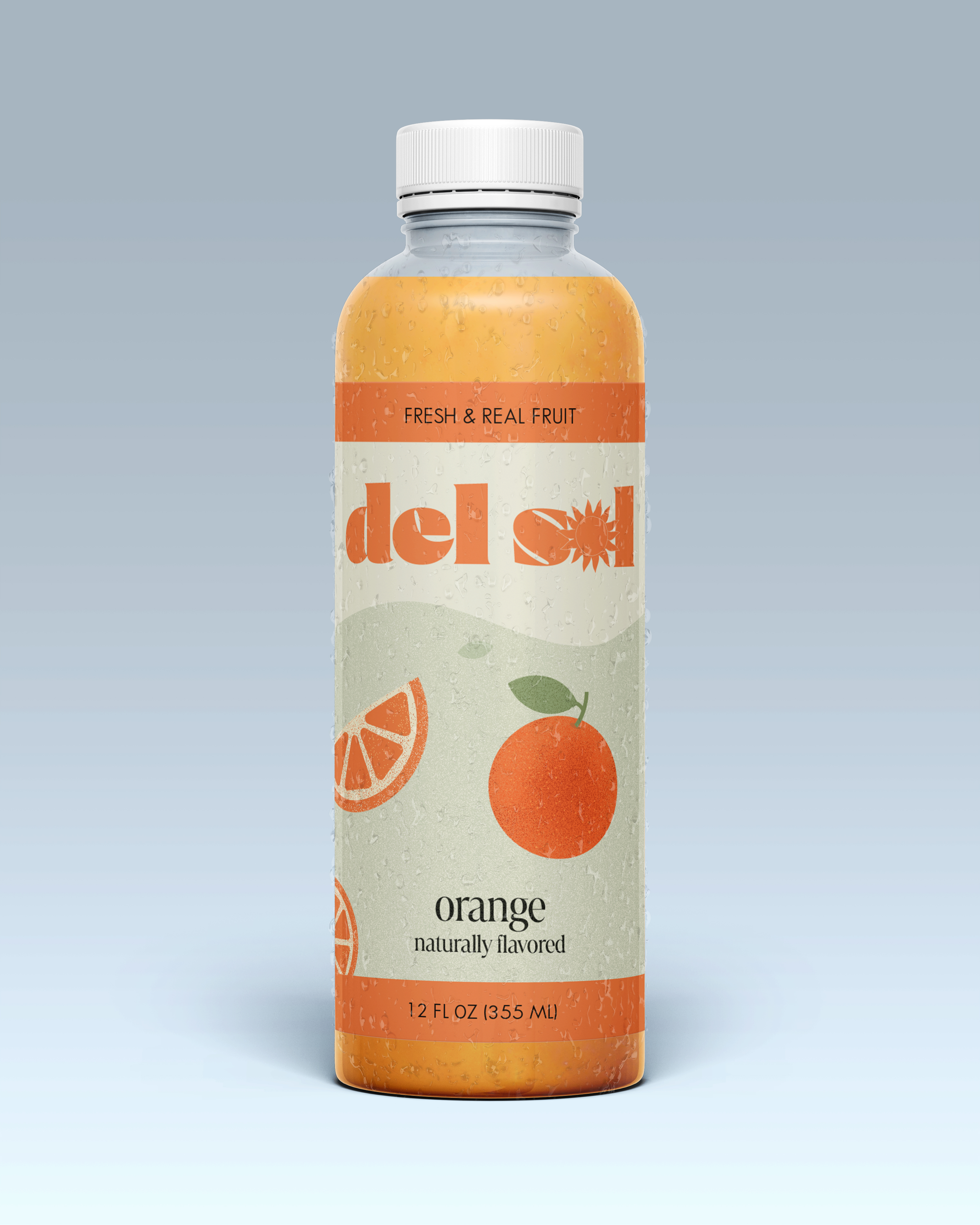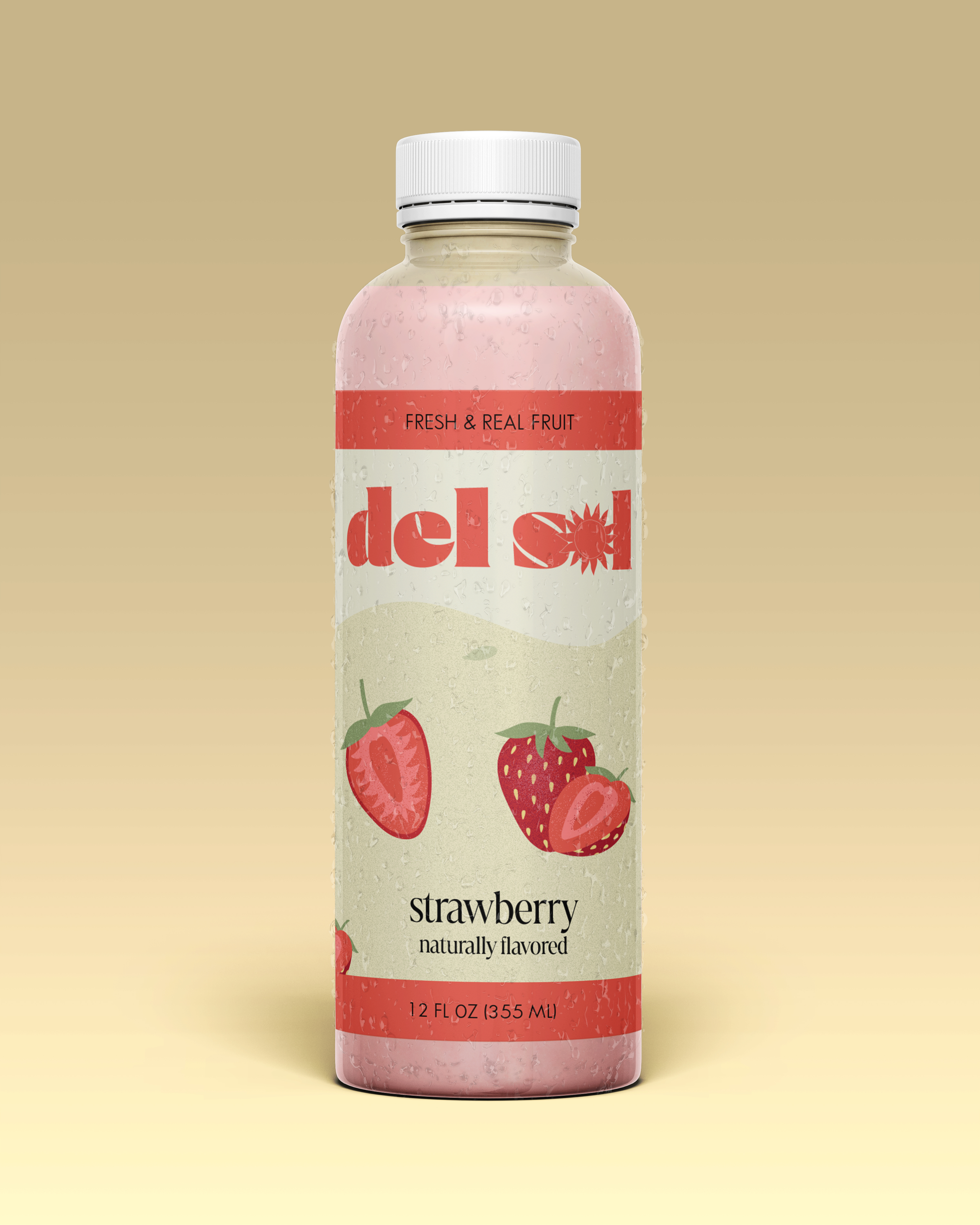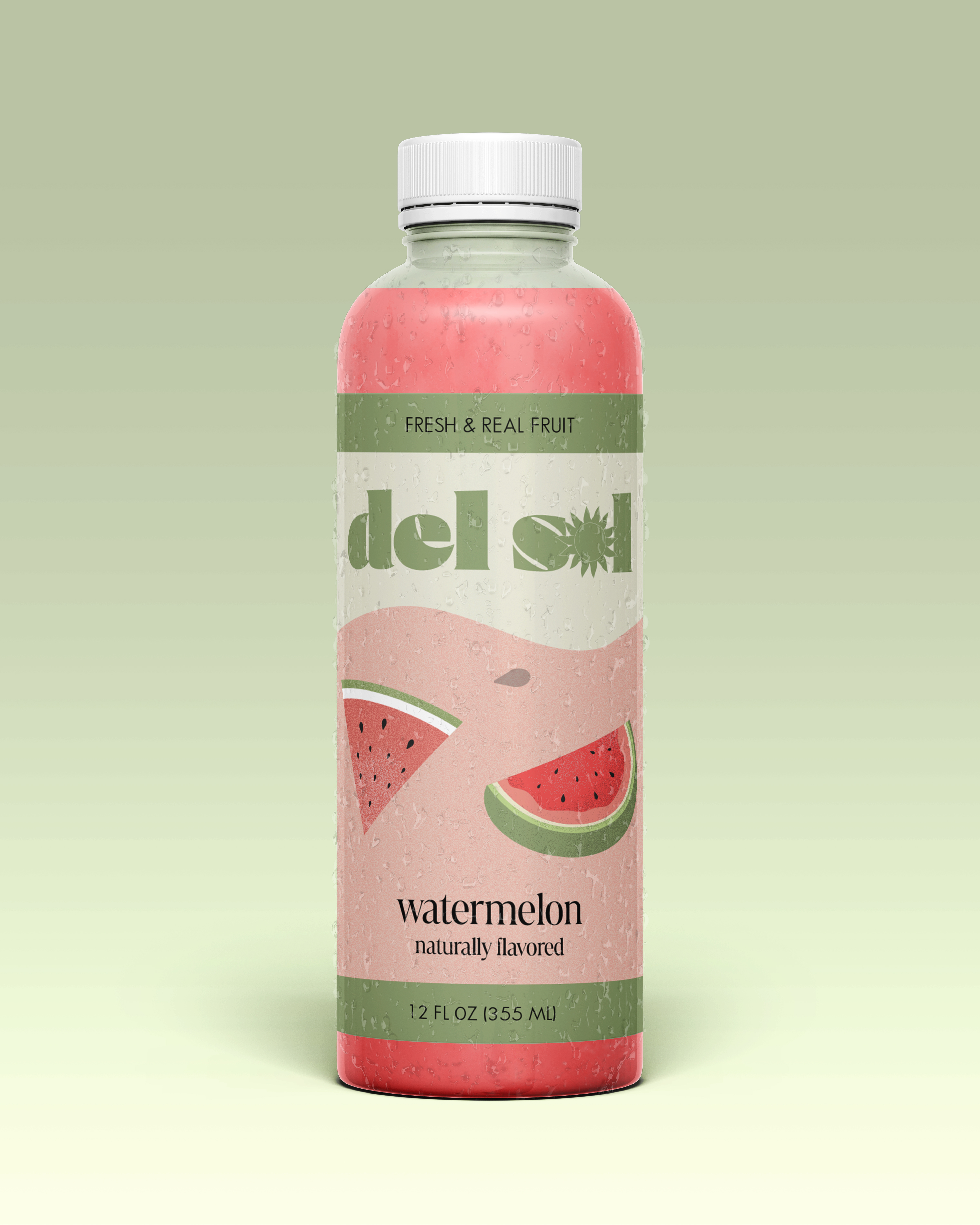

Del Sol is a packaging design project for which I made three packaging labels for a juice brand to create visually compelling designs that would be eye-catching to consumers.
I wanted to evoke the essence of summer, delight, and freshness since fruit juice is a perfect summer drink. I named it Del Sol, meaning “the sun” in Spanish. I began by making the logo, in which I added a sun image to speak to the name. The thought was to form a memorable illustration in which consumers could understand its meaning by looking at it. For the color palette, I used pastels because it gives a soothing, bright, and calming look. Each palette speaks to the colors of the fruits found on the name of each bottle. I then selected typography that included the design's style and aesthetic. I looked for fonts that would be simple, however, keep up a lively and vibrant feel. I chose Courage for the logo, Marlide Display, and Sans Serif for the rest of the design. At last, I created different illustrations for all three of the fruits and arranged them into the final labels for my packaging design.
