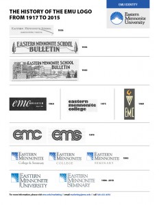
With centennial celebrations planned for 2017-18, a new strategic plan in development, and increasingly diverse program offerings, Eastern Mennonite University has revitalized its logo. The former logo and font first came into use in 1994, when Eastern Mennonite College changed its name to Eastern Mennonite University (EMU).
This revision honors the past while featuring elements that speak to themes called for by alumni, students, faculty and staff in an updated design: global awareness, openness, and sharing knowledge and the light of Christ outwardly. It also has a slightly brighter color scheme and updated font.
“This change marks an evolution of the logo,” notes President Loren E. Swartzendruber. “It builds on the past, bringing fresh vitality to our already strong image. We were not looking to ‘rebrand’ the institution. Our brand is strong and there is much to celebrate from the past.”
The revision process began in August 2014 with the help of Gravity Group, a Harrisonburg-based brand consultant group.

Stakeholders – students, alumni, parents, faculty and staff – completed surveys and joined in discussion groups. Two main questions generated conversations: “What does the current EMU logo communicate to you?” and “If the logo were changed, what should a new or revitalized logo do?”
Unanimously more than 300 respondents called for a revision of the logo, while sharing a concern that any change honor the past and build on EMU’s global recognition.
The review process resulted in a call for a logo that:
- Balances between and honors the institution’s past and future;
- Reflects values of peace and justice, transformation and sustainability;
- Reflects the Christian Mennonite values at EMU, sharing knowledge and the light of Christ outwardly;
- Communicates diversity, a global perspective, and the warmth of a welcoming, lasting community;
- Highlights a strong focus on rigorous academics;
- Communicates a bold, vibrant vision.
“The revitalized logo offers a fresh, forward-thinking impression yet also preserves the brand equity that EMU has earned over the years locally and around the world,” says Andrea Schrock Wenger, director of marketing and communications.
Media specialist and brand ID manager Jon Styer, a 2007 graduate of EMU’s visual and communication arts program, praised the logo’s articulation with the current color scheme and font standards. “It solves some design challenges that came with the earlier version, updates our look and provides a lot of opportunity,” he added.
“This revised logo evolves the brand identity of EMU to reflect how much the brand itself has grown,” says Christian Perritt, creative director of Gravity Group. “The bold new icon, the font that is both traditional and uniquely contemporary – these elements work together to reflect a brand that has a rich history and a bright future.”
Read more about the logo revitalization process at www.emu.edu/logo
